
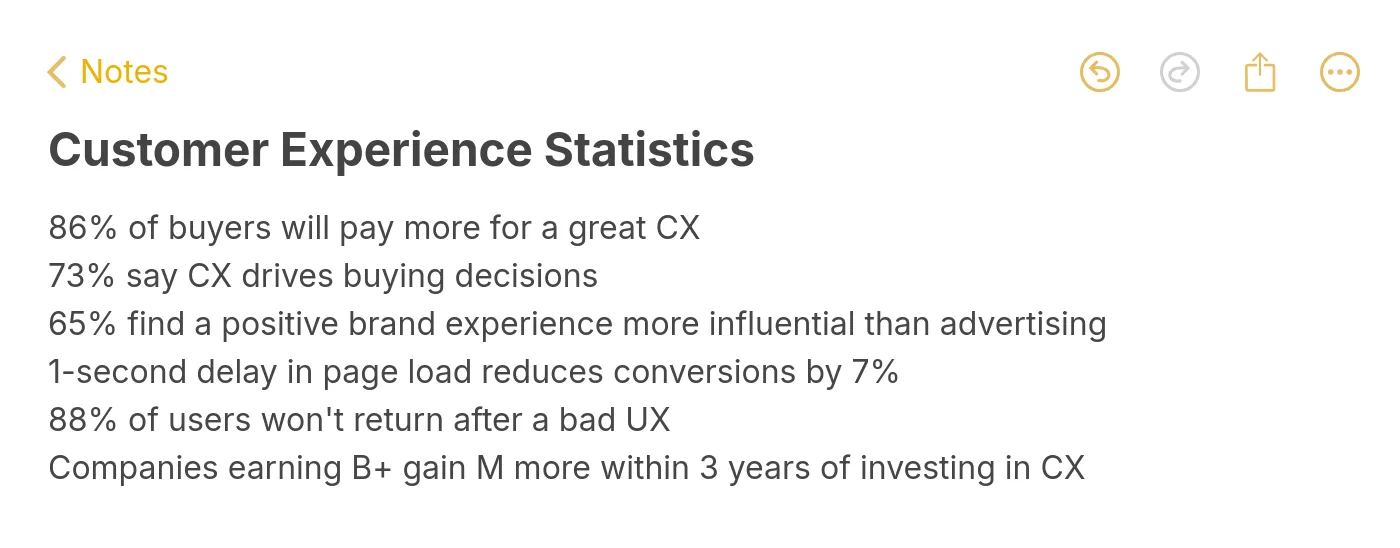
You can improve customer experience on your website by focusing on eight practical methods: defining brand personality, speeding up page loads, refining visual design, simplifying navigation, creating value-driven content, displaying social proof, streamlining checkout, and adding AI-powered support. Each method below includes implementation steps and data-backed evidence so you can start making changes today.
Summary of all 8 methods to improve customer experience:
1. Define Your Brand Personality — Build trust and recognition with a consistent voice across every page
2. Speed Up Page Load Times — Cut bounce rates by reducing load time below 2.5 seconds
3. Improve Visual Design and Layout — Guide visitors to key actions with intentional design choices
4. Simplify Site Navigation — Help users find what they need within three clicks
5. Create Value-Driven Content — Reduce support tickets and build authority with targeted long-form content
6. Display Customer Reviews and Social Proof — Increase conversion rates by showing real user feedback
7. Streamline the Checkout Process — Remove friction that causes cart abandonment at the final step
8. Add AI-Powered Customer Support — Resolve queries instantly with trained AI chatbots available around the clock
1. Define Your Brand Personality: Build Trust Through Consistency
Brand personality turns a generic website into something recognizable. It's the difference between a site visitors forget immediately and one they return to. When your tone, color palette, imagery, and messaging stay consistent from homepage to checkout to support pages, visitors develop familiarity faster. That familiarity reduces decision fatigue and builds the trust that drives repeat visits.
How to implement:
1. Write a one-page brand voice guide that defines three adjectives for your brand (e.g., "direct, warm, technical"). Every page, email, and chat message should pass this filter
2. Audit your website for tone inconsistencies. Marketing pages often sound different from support docs or product descriptions. Align them
3. Apply your brand colors and typography consistently. Use a design system or style guide that locks down hex values, font weights, and spacing
4. Extend your personality into microcopy: error messages, loading states, confirmation screens. These small touchpoints shape how people feel about your brand more than hero banners do
According to ClearlyRated's 2026 report, 89% of businesses now compete primarily on customer experience rather than price or product features. Companies with a recognizable, consistent brand voice across all customer touchpoints report higher retention because visitors know what to expect. For B2B SaaS sites, expect 2-4 weeks to see measurable improvements in return visit rates once you've standardized your brand voice across all pages.
2. Speed Up Page Load Times: The Foundation of Good UX
Page speed isn't a nice-to-have metric buried in your analytics dashboard. It's the first thing visitors experience, and it shapes every interaction that follows. A site that loads in under 2 seconds feels responsive and professional. A site that takes 4+ seconds feels broken, and most visitors won't wait around to find out if it isn't.
How to implement:
1. Run Google PageSpeed Insights on your top 5 landing pages. Focus on Largest Contentful Paint (LCP) first since it has the strongest correlation with bounce rate
2. Compress images using WebP format. Most hero images can drop from 2MB to under 200KB without visible quality loss. Use lazy loading for below-the-fold images
3. Minimize render-blocking JavaScript. Move non-critical scripts to async loading and defer third-party widgets that don't affect above-the-fold content
4. Use a CDN (Content Delivery Network) for static assets. For global B2B SaaS sites, this alone can cut load times by 40-60% for international visitors
5. Set a performance budget: LCP under 2.5 seconds, Interaction to Next Paint (INP) under 200ms, Cumulative Layout Shift (CLS) under 0.1. Monitor weekly using Chrome UX Report
According to eDesign Interactive, 94% of first impressions are design-related, and load speed is the earliest design signal visitors encounter. Sites meeting all three Core Web Vitals thresholds rank higher and retain more visitors. Only about half of all websites currently pass these benchmarks, which means improving your speed puts you ahead of most competitors within 1-2 weeks of optimization work.
3. Improve Visual Design and Layout: Guide Users to Action
Good design isn't about making things pretty. It's about removing confusion. Every element on a page should either help visitors complete a task or get out of the way. When button colors, spacing, font sizes, and visual hierarchy are intentional, users don't need to think about where to click. They just do.
How to implement:
1. Establish a clear visual hierarchy: primary CTA buttons in a high-contrast color, secondary actions in a muted tone, and tertiary links as plain text. One primary action per page section
2. Use whitespace generously. Dense, cramped layouts feel overwhelming. A 20-30% increase in padding between sections typically improves readability scores and time on page
3. Ensure your site meets WCAG 2.2 accessibility standards: minimum 4.5:1 contrast ratio for text, keyboard-navigable elements, and descriptive alt text on all images
4. Test your layouts on mobile first. With Google's mobile-first indexing, your mobile experience is what gets ranked. If something doesn't work on a phone screen, it's not working
According to a LinkedIn report citing Deloitte research, companies shifting from traffic-driven to experience-driven models are 71% more likely to report improved customer loyalty. The takeaway: investing in design that prioritizes user tasks over visual polish delivers stronger retention. For most sites, a focused redesign of your top 3 landing pages produces visible engagement improvements within 30 days.
4. Simplify Site Navigation: Reduce Clicks, Reduce Frustration
Navigation is where most website experience problems start. If visitors can't find what they're looking for within a few seconds, they leave. It doesn't matter how good your product is or how polished your content looks. Confusing menus, buried pages, and inconsistent labeling kill conversions before visitors even reach your value proposition.
How to implement:
1. Limit your primary navigation to 5-7 items. Every additional menu item increases cognitive load and reduces click-through rates on the items that matter most
2. Use descriptive labels instead of clever ones. "Pricing" beats "Investment." "Documentation" beats "Resources." Users scan, they don't interpret
3. Add a persistent search bar with autocomplete. For sites with 50+ pages, search becomes the fastest path to any content. Track what people search for to identify navigation gaps
4. Implement breadcrumb navigation on all interior pages. Breadcrumbs reduce bounce rates by giving users an easy way to step back without hitting the browser's back button
5. Audit your site depth: every important page should be reachable within 3 clicks from the homepage. Pages buried at depth 4 or deeper get significantly less organic traffic
According to ClearlyRated, 52% of consumers stopped buying from a brand after a single bad experience (citing PwC data). Poor navigation is one of the most common bad experiences. If your customer success metrics show high bounce rates on interior pages, navigation confusion is likely the root cause. Expect measurable improvements in engagement within 1-2 weeks of simplifying your menu structure.
5. Create Value-Driven Content: Answer Questions Before They're Asked
Content isn't just a traffic channel. It's a customer experience tool. When someone lands on your site with a question and finds a clear, thorough answer, that builds trust faster than any sales page. The best B2B SaaS websites use their blog, knowledge base, and resource library to reduce support load while simultaneously pulling in organic traffic.
How to implement:
1. Pull your top 20 support tickets from the last 90 days. Turn each recurring question into a detailed help article or blog post. This reduces support volume and improves the website experience for self-serve visitors
2. Write long-form guides (1,500-3,000 words) for your core topics. Include step-by-step instructions, screenshots, and real examples. Generic 500-word posts don't rank and don't help anyone
3. Update existing content quarterly. Refresh outdated statistics, fix broken links, and add new sections covering recent developments. Content updated within 30 days earns 3.2x more AI citations
4. Structure every article with an answer capsule in the first paragraph, followed by query-optimized H2 headings. This format performs well in both traditional search and AI-generated results from tools like Perplexity and ChatGPT Search
According to McKinsey, a strategy focused on improving the experience of existing customers can deliver breakthrough growth for incumbent companies. Value-driven content directly supports this: visitors who find useful, accurate information are more likely to convert and less likely to churn. For B2B SaaS, expect your highest-performing content pieces to start generating meaningful traffic within 60-90 days of publication.
6. Display Customer Reviews and Social Proof: Let Users Sell for You
Social proof works because people trust other people's experiences more than they trust marketing copy. Testimonials, case studies, ratings, and user-generated reviews reduce the perceived risk of trying a new product. For B2B SaaS buyers who need to justify purchasing decisions to their team, third-party validation can be the deciding factor.
How to implement:
1. Place your strongest testimonial on your homepage, above the fold if possible. Include the person's full name, company, and role. Anonymous quotes carry almost no weight
2. Create dedicated customer stories that walk through the problem, solution, and measurable result. Structure them as mini case studies: situation, approach, outcome
3. Display third-party review scores (G2, Capterra, TrustRadius) on pricing and product pages. These carry more credibility than self-selected testimonials because visitors know they can't be cherry-picked
4. Add review widgets near conversion points: pricing pages, checkout flows, and signup forms. The closer the social proof is to the decision moment, the more effective it becomes
5. Collect reviews actively. After onboarding or a support interaction, send a short feedback request. Most satisfied customers are willing to leave a review but won't do it unprompted
According to Giva, 71% of consumers expect personalized interactions, and real customer stories are the most personalized form of marketing because they reflect actual use cases. Social proof pages that include specific metrics ("reduced response time by 60%") convert at higher rates than those with vague praise ("great product, love it"). You can expect conversion rate lifts of 10-25% on pages where testimonials are placed near CTAs, typically visible within 2-4 weeks of implementation.
7. Streamline the Checkout Process: Remove Every Unnecessary Step
Checkout is where revenue lives or dies. You've already done the hard work of attracting visitors, building trust, and convincing them your product is worth buying. A confusing checkout process throws all of that away. Every extra form field, every unclear error message, every surprise fee pushes people toward the exit.
How to implement:
1. Reduce your checkout to 3 steps or fewer: cart review, payment details, confirmation. Each additional step drops conversion by roughly 10%
2. Offer guest checkout. Forcing account creation before purchase causes significant abandonment. Let people buy first, then offer account creation on the confirmation page
3. Show all costs upfront. No hidden fees at the last step. Shipping costs, taxes, and processing fees should be visible from the cart page. Surprise costs are the number-one reason for abandonment
4. Support multiple payment methods: credit card, PayPal, Apple Pay, Google Pay at minimum. Each additional payment option captures a segment of buyers who'd otherwise leave
5. Display security badges and trust indicators near payment fields. SSL certificate icons and payment processor logos reduce anxiety at the exact moment it peaks
According to Salesmate, poor customer service experiences put $3.8 trillion in global revenue at risk in 2026. Checkout friction is a major contributor to that figure. For e-commerce and SaaS subscription flows, a checkout redesign typically shows measurable conversion improvements within the first week. Even small changes, like removing one form field or adding a progress indicator, can lift completion rates by 5-15%.
8. Add AI-Powered Customer Support: Instant Answers, Every Time
Customers don't want to wait. They don't want to fill out a contact form and check their email two days later. They want answers now, and AI-powered support tools make that possible. A trained AI chatbot can handle the majority of common questions instantly, freeing your human support team to focus on complex issues that actually require human judgment.
How to implement:
1. Start by training your AI chatbot on your existing knowledge base, help docs, and FAQ pages. Tools like LiveChatAI let you import your content and generate accurate, context-aware responses without manual scripting
2. Set up human handoff triggers. When the AI detects frustration, repeated questions, or topics outside its training data, it should escalate to a human agent with full conversation context
3. Deploy the chatbot on high-intent pages first: pricing, checkout, and product comparison pages. These are where visitors have the most questions and where fast answers have the biggest impact on conversion
4. Review chat transcripts weekly. Look for questions the AI struggles with and add those answers to your training data. This continuous feedback loop improves accuracy over time
5. Combine AI chat with live chat best practices: proactive greetings on pages with high exit rates, chat triggers based on time on page or scroll depth, and canned responses for your most common human-handled queries
According to Medallia's 2026 State of Customer Experience report, 66% of CX practitioners believe their experiences improved last year, but only 17% of consumers agree. That gap shows why reactive support isn't enough: you need proactive, always-available tools. AI chatbots can increase sales and reduce support ticket volume by up to 70%, with measurable results within the first two weeks of deployment. The key is training quality. A chatbot trained on your actual product documentation outperforms one built on generic templates every time.
Which Methods You Can Prioritize for Customer Experience

If you're unsure where to begin, start with page speed and AI support. They require the least effort and produce the fastest measurable results. From there, work through navigation and social proof before tackling larger projects like content strategy and design overhauls.
Start With What Matters Most
You don't need to overhaul your entire website at once. Pick the two methods from this list that address your biggest pain points right now. If your pages load slowly, fix that first. If you're drowning in support tickets, deploy an AI chatbot this week.
The companies that improve customer experience on their website most effectively aren't the ones with the biggest budgets. They're the ones that measure, test, and iterate consistently. Track your customer service performance, identify the friction points, and address them one at a time.
Every improvement compounds. Faster pages lead to longer visits. Better navigation leads to deeper engagement. Instant support leads to higher satisfaction scores. These aren't isolated wins. They reinforce each other.
Frequently Asked Questions
How do you improve customer experience on a website?
Focus on the fundamentals first: fast page loads, clear navigation, and instant support options. These three factors shape most visitors' first impressions. Then layer on personalization, social proof, and high-quality content. The key is measuring what you change. Use customer success metrics like bounce rate, time on page, Net Promoter Score, and support ticket volume to track whether each improvement actually moves the needle. Don't guess. Test one change at a time and measure the result before moving to the next.
What are the 4 P's that improve customer service?
The 4 P's are Promptness (responding quickly), Politeness (maintaining a respectful tone), Professionalism (demonstrating competence), and Personalization (treating each customer as an individual). For websites, promptness is the most impactful. Industry research shows over 50% of customers will switch to a competitor after a single unsatisfactory experience, and slow response times are one of the most common complaints. AI chatbots directly address the promptness gap by providing instant responses 24/7.
Why does website speed matter for customer experience?
Speed sets expectations. A site that loads in under 2 seconds signals professionalism and reliability. A site that takes 4+ seconds signals neglect. Beyond perception, slow sites lose visitors before they even see your content. Google uses Core Web Vitals (LCP, INP, CLS) as ranking factors, so poor speed also reduces your organic visibility. The compounding effect is significant: fewer visitors arrive, and those who do leave faster.
How does personalization affect customer experience on websites?
Personalization reduces noise. Instead of showing every visitor the same generic page, you surface what's relevant to them based on their behavior, preferences, or segment. According to Giva, 71% of consumers expect personalized interactions. For B2B SaaS, this means showing different case studies to different industries, adjusting conversational marketing messages based on company size, or recommending features based on the visitor's use case. Start simple: personalize by industry or referral source before attempting full behavioral personalization.
What tools help measure website customer experience?
Google Analytics 4 tracks behavioral metrics (bounce rate, engagement time, conversion events). Hotjar or Microsoft Clarity provide heatmaps and session recordings so you can see where users get stuck. For direct feedback, tools like Typeform or in-app surveys capture qualitative data. AI chatbot platforms like LiveChatAI provide conversation analytics showing what customers ask most often, which pages generate the most support requests, and where the chatbot resolves issues versus escalating to humans. Combine quantitative data (what happened) with qualitative data (why it happened) for the clearest picture.
For further reading, you might be interested in the following:
• 13 Best AI Shopping Chatbots


